Get updates delivered to you daily. Free and customizable.
Livingetc
'The World of Color is Rife With Danger' — 5 Color Combinations That Don't Go Together and What to Use Instead
By Emma Breislin,
21 days ago
There is a reason neutral color schemes are considered the ‘safe’ option when it comes to decorating. The world of color is rife with danger, and there are so many combinations that clash and colors that don’t go together.
We’ve all heard the adage that blue and green should never be seen — although I don’t know how much I agree with it — and read color theory that suggests how certain shades should be paired. But rules are meant to be broken, right?
After asking a few designers and color experts for their thoughts, I've learned that very few are prepared to draw a line on what color combinations you should avoid. It all depends on the application.
‘For me, if put on the spot, I would have a problem with yellow and gray together,’ says paint decoration specialist and Farrow & Ball ambassador, Patrick O’Donnell. He prefaces that that may be because of the placement of warm and cool colors together or 'It could just be bad memories of early eighties decorating.'
Color carries a lot of meaning, you see. Color psychology in interior desin tells us that our choice of palette can even effect our mood, so it shouldn't be chosen lightly. And yes, while clashing colors can absolutely work when done by a deft hand, here are five examples — provided by the experts — of colors that don't go together, and what you should do instead.
1. Red and Green
(Image credit: Diana Paulson / Linea Photo)
One color combination to avoid is putting too many saturated and vibrant shades next to one another. 'A bright red with a vivid green can create a jarring and overwhelming effect reminiscent of holiday decorations rather than a cohesive design scheme,' explains Jodi Peterman , CEO of interior design firm Elizabeth Erin Designs.
'Instead, consider pairing a bright red with a neutral shade like a soft neutral color such as Swiss Coffee OC-45 from Benjamin Moore or a muted navy, 1624 Westcott Navy, for a more sophisticated look,' Jodi adds.
That's not to say that these colors can't ever complement each other, though. In fact, red and green do go together , you just have to pick the right shade of each, or add in another hue to balance them out.
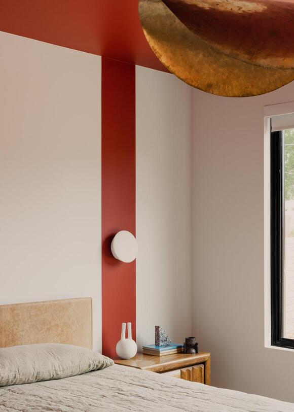
(Image credit: Tatjana Plitt. Design by Hindley & Co)
Similar to the issue paint decoration specialist Patrick O'Donnell took with mixing warm and cool colors yellow and gray together, Jodi agrees that clashing warm and cool tones without including a unifying element can disrupt the flow of a room.
'For example, pairing a warm terracotta with a cool lavender can be discordant,' she explains. 'Instead, choose one dominant tone and use the other as an accent. Pair terracotta with warm neutrals like taupe or cream, or pair lavender with cool grays or whites to create a more cohesive and pleasing aesthetic.'
3. Purple and Red
(Image credit: Prue Ruscoe. Design: YSG Studio)
Known for her textural design approach and ability to play with clashing colors , interior designer Yasmine Ghoniem , founder of YSG Studio, admits, rather unsurprisingly, that she doesn't have any rules when it comes to matching — or 'artfully mis-matching' — shades. There are still a few combinations she'd urge you to avoid, though, including purple and red.
'But a murkier aubergine shade could work with red if you don't pair the colors right next to each other,' she clarifies, referencing this living room from one of her projects as proof of that. In it, a pistachio green wall and rich, red velvet armchair sit underneath a hand-painted aubergine ceiling.
'The burgundy Utrecht red armchair provides a glowing focal point without dominating the space,' she explains. 'And given the intense shade in this one piece, the expanse of the ceiling and shade of the large rug balance it.'
And while on the topic of colors that go with purple , or rather don't, Yasmine also warns against pairing the shade with yellow. 'It's far too jarring,' she says.
Ebello 38" Wide Armchair in Red
Price: $249.99
Fabric: Chenille
4. Lemon Yellow and Black
(Image credit: Prue Ruscoe. Design: YSG Studio)
Another color combination Yasmine recommends avoiding is a soft lemon yellow with black. 'Only a bold yellow can match the engulfing power of black,' she says.
In this living room scheme, a penthouse apartment by YSG Studio, the colors in the Murano glass lighting totems work to balance the other shades in the space — the musk, candy pinks, lilacs, burgundy and bold black ceiling color .
'Note how the yellow and orange shades are golden, not soft pastels, so they can stand up to the chestnut brown and black rings [on the totems]' says Yasmine.
5. Blue and Red
(Image credit: Kieran Reeves. Design by Ashley Ferguson Interiors)
Antonia Caicedo , interior designer and design director at JIMECO, says to be careful about how to pair blue and red together. 'It's not only about the color, but also the tonality and shade of each,' she explains.
Blue and red are particularly tricky colors to pair together when you're decorating with primary colors . 'But they can look great when you use softer hues of each,' adds Antonia. 'Powder blue and red can look fantastic together, and if you are a lover of bold interiors, blue and rust can also be a great color combination to look into.'
Kane Nightstand in Sky
Price: $329
Colors: Sky, Dark Green, Ivory, Rose
How to know if a color combination will work together?
There are a range of different tips and tricks that designers use when determining whether a color palette will work, or to fix an off-balance color palette . You can, of course, look to color charts and color theory. But Yasmine says to forget that, and instead head outdoors.
'Nature is the ultimate color co-ordinator — look at shades of the sky (from grays to the brightest of blues) against the greens of leaves, and the color of soil or sand and rock formations too,' she says. 'Fresh flower and fruits and vegetable markets are really inspiring too. I once presented a painter with an incredible purple aubergine, requesting he translate the shade across the ceiling of a home with a Marmorino plaster.'
If you don't have the luxury of abundant nature near you, there is also inspiration to be found in the bustling city. 'A neon sign popping against a painted wall, or patterned pastel pants on a curry yellow plastic transport seat,' describes Yasmine. 'I'm often saving snaps on my phone when I find combinations that really zing.'
Get updates delivered to you daily. Free and customizable.
Welcome to NewsBreak, an open platform where diverse perspectives converge. Most of our content comes from established publications and journalists, as well as from our extensive network of tens of thousands of creators who contribute to our platform. We empower individuals to share insightful viewpoints through short posts and comments. It’s essential to note our commitment to transparency: our Terms of Use acknowledge that our services may not always be error-free, and our Community Standards emphasize our discretion in enforcing policies. We strive to foster a dynamic environment for free expression and robust discourse through safety guardrails of human and AI moderation. Join us in shaping the news narrative together.


 Most Popular
Comments / 0