Get updates delivered to you daily. Free and customizable.
Creative Bloq
The new Verizon logo is a glowing success
By Joe Foley,
3 days ago
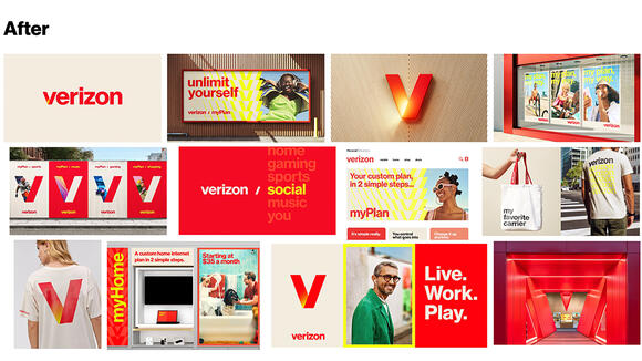
Verizon has a new logo, and the wireless provider is ditching its staid, corporate look for. The refresh introduces a more vibrant identity that rediscovers the brand's electricity... even if it does look a little like another brand in some applications.
Central to the rebrand, the new Verizon logo no longer has that signature little red tick, which it decided had failed to achieve an emotional engagement with customers. Rather than replace it with a new symbol, Verizon is making colour its distinguishing characteristic, introducing a glowing gradient on the 'V', which can now be used both in the full logotype and on its own (see our piece on the best uses of colour in branding ).
the Verizon logo before (top) and after (bottom) (Image credit: Verizon)
Verizon's sticking with Monotype's Neue Haas Grotesk as the font for the logotype, but it's now using red as the main colour, while shades of beige and yellow have been introduced in supporting roles. The 'V' sports a warm gradient glow, retaining a connection with the idea of electricity, which is what inspired the 'checkmark' in the original Verizon logo before the 2015 rebrand.
The Verizon logo from 2000 to 2015 (Image credit: Verizon)
Developed with Turner Duckworth , the Verizon rebrand and its timing are understandable. If the 2015 logo had any personality, it was one that was dry and sensible. The design was corporate and clinical, stressing the reliability of the brand's coverage. But it felt like one of those designs that's barely there; that you might not notice.
My initial impression is that the new logo will be more recognisable, while emphasising the brand's extra services beyond mere wireless coverage: streaming and gaming etc. Several people have pointed out on social media that when the 'V' is used alone, it looks quite like a well-known streaming service's app logo (see the history of the Netflix logo ), and I wonder if that might even be a knowing reference, presenting Verizon as an entertainment provider rather than just a wireless service.
Image 1 of 2
(Image credit: Verizon) Image 2 of 2
(Image credit: Verizon)
“Verizon is a strong, trusted brand that plays a critical role in people's lives, but most of what we do is often invisible and behind the scenes. We want to make the invisible, visible,” says Leslie Berland, Verizon Chief Marketing Officer. “The new logo, design system and creative approach pulls inspiration from the company's heritage while infusing the energy, vibrancy, and experience of life powered by everything Verizon offers.”
To announce the brand refresh, the company has released a new TV spot (see above) that references its well-known “Can You Hear Me Now?” campaign. The film stars a real Verizon network engineer as the “test man”.
Get updates delivered to you daily. Free and customizable.
Welcome to NewsBreak, an open platform where diverse perspectives converge. Most of our content comes from established publications and journalists, as well as from our extensive network of tens of thousands of creators who contribute to our platform. We empower individuals to share insightful viewpoints through short posts and comments. It’s essential to note our commitment to transparency: our Terms of Use acknowledge that our services may not always be error-free, and our Community Standards emphasize our discretion in enforcing policies. We strive to foster a dynamic environment for free expression and robust discourse through safety guardrails of human and AI moderation. Join us in shaping the news narrative together.


 Most Popular
Comments / 0